
Debugging Responsive Designs with Ghost CSS
- Border7 Studios

- Jan 8, 2016
- 2 min read
Updated: May 11, 2022
Debugging Responsive Designs
Responsive web design presents many new challenges over traditional design. Making sure that your page looks perfect at every single screen size is not an easy thing, after all. Every developer has been there: some pesky element is pushing to far horizontally, and creating a horizontal scroll bar, but you can’t seem to figure out which element is causing this annoyance.
This is where the Ghost CSS bookmark will come in handy.
When you activate the Ghost CSS bookmark it will change the styles on the page to easily show the outlines of elements on the page. Using this, you should be able to more easily diagnoses which element is causing the problem. You will be able to visually see which element’s boundaries are extending further than the rest to identify how the responsive code is breaking.
Here’s how to get it:
Step 1: Right click the bookmarks bar and click “add page.” Step 2: Name the bookmark whatever you want. Step 3: In the URL section add this bit of code:
javascript:(function(){document.body.innerHTML+=%22<style>*{background:%20#000%20!important;color:%20#0f0%20!important;outline:%20solid%20#f00%201px%20!important;}</style>%22;})();
What this code is doing is actually simple, it is running a Javascript function that changes the CSS styles on your current page, to the Ghost CSS styles.
Step 4: Click done. Your bookmark is now created. Now, upon clicking this bookmark your page will change to show the Ghost CSS styles. To revert the change, simply refresh the page.

ABOVE: Here’s how border7.com looked before the bookmark was clicked
BELOW: And here’s how border7.com looked after the bookmark was clicked and the Ghost CSS styles went into effect.

Here’s how to debug with it:
For example, let’s say that you’re working with a responsive contact us page and for some reason there’s a horizontal scroll bar.
You look and you look but you cannot find the element that is breaking the responsive.
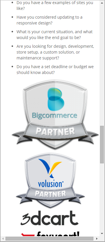
Before your page looked like this:
After you click the Ghost CSS bookmark your page looks like this:
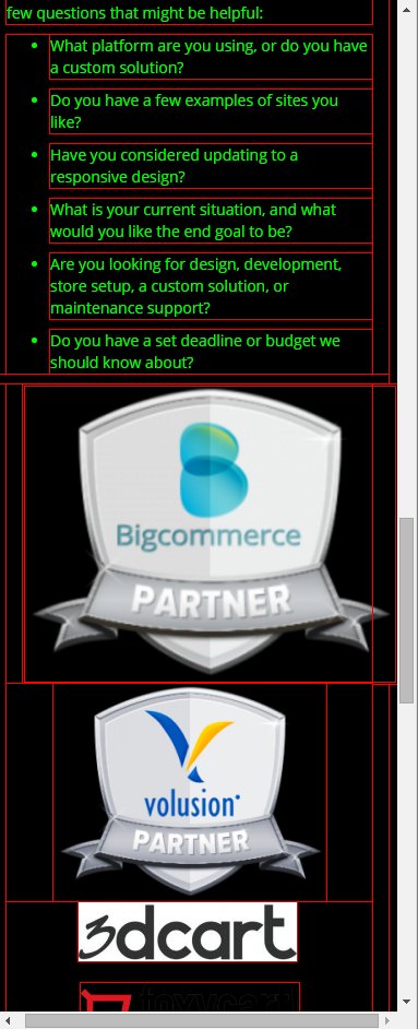
In the after screenshot, you can see that the reason the responsive is being broken is the top shield image. Now this was probably a very easy example and you’ve got to be thinking, “I could have done that all without those styles enabled”, and yes you probably could. At least for this example. But anyone who knows about how to code for a responsive design knows that it’s not always this easy.
Ghost CSS will enable you to visually see on the page where elements are that are breaking responsive, without dealing with the DOM explorer right off the bat. Plus, you’ll look like an advanced hacker when you press that bookmark! That’s always a plus.


